To support architects, interior designers and planners in selecting upholstery solutions, Sitlosophy introduces Color Palette, a new design tool that gathers all fabrics and finishes from the Sartorial and Essential collections into curated color palettes created to simplify combinations and encourage a more intuitive, harmonious and contemporary design approach.
Designing a space means creating a balance between aesthetics, functionality, materials and perception. Within this process, color plays a fundamental role: it defines the character of an environment, influences people’s wellbeing and helps build coherent and recognizable visual identities.
More than a simple color collection, Color Palette represents a design-oriented method capable of transforming material selection into a more immediate and inspiring experience.
The role of color in contemporary spaces
Within workplaces, hospitality environments, contract projects and shared spaces, color is no longer just a decorative element. Upholstery tones contribute to defining the mood of a space, influence the perception of comfort and help create environments consistent with the function and identity of the project.
Warm palettes convey energy, hospitality and conviviality. Cool colors communicate balance, concentration and calmness. Neutral tones, on the other hand, allow the creation of elegant, timeless and easily customizable spaces.
The correct selection of fabrics, textures and finishes therefore becomes an integral part of the design process for offices, meeting rooms, lounge areas, hospitality projects and collaborative environments.
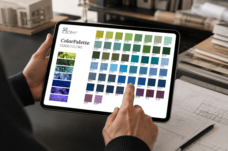
A new way to select upholstery and materials
Color Palette was created to make the selection of Sitlosophy upholstery solutions easier and faster. All materials available within the Sartorial and Essential collections have been organized into chromatic palettes designed to guide designers and clients in creating harmonious and coherent environments.
Each palette has been conceived as a practical design tool capable of supporting the definition of the atmosphere of a space and the combination of materials.
The palettes are divided into four main chromatic families:
Warm Colors: energy and materiality
The Warm Colors palettes include warm, enveloping and deep tones inspired by earth, natural light and organic materials. Yellows, oranges, reds, terracotta shades and burgundy tones help create welcoming environments full of personality.
These colors are particularly suitable for hospitality spaces, lounge areas, relaxation zones, restaurants and environments dedicated to social interaction and sharing.
Cool Colors: balance and focus
The Cool Colors palettes include greens, blues and cool tones capable of conveying calmness, balance and contemporaneity. They are ideal solutions for professional environments, meeting rooms, executive offices and operational spaces where concentration and visual comfort play a key role.
Cool shades also help create sophisticated and visually light environments, perfectly suited to contemporary interior design.
Soft Colors: naturalness and visual continuity
The Soft Colors palettes feature soft, delicate and natural tones that encourage wellbeing and visual harmony. Beige, sand, ivory, hazelnut and dusty warm shades help create bright, relaxing and elegant spaces.
These palettes are particularly suitable for residential projects, high-end hospitality environments and spaces where perceived comfort becomes a central part of the experience.
Neutral Colors: timeless essentiality
The Neutral Colors palettes gather whites, greys, anthracite and black tones designed for minimal, refined and versatile projects. Neutral shades help enhance the architecture of a space and create environments that can easily be personalized through details, lighting and materials.
They are an ideal choice for contemporary offices, conference rooms, contract projects and multifunctional spaces.
Materials and upholstery solutions for contemporary contract design
Color Palette enhances the wide selection of Sitlosophy upholstery solutions, including technical fabrics, wool, eco-leather, leather and recycled materials developed for office, contract and hospitality environments.
The collections include fire-retardant fabrics, Trevira CS materials, post-consumer recycled polyester upholstery and finishes designed to ensure durability, comfort and long-lasting aesthetic quality.
The organization into palettes helps immediately visualize possible combinations between textures, colors and materials, simplifying the design process and speeding up the definition of finishes.
Design, ergonomics and spatial identity
In contemporary design, comfort and aesthetics must coexist naturally. Seating solutions are no longer merely functional elements; they become tools capable of building relationships, defining atmospheres and improving users’ everyday experience.
Through Color Palette, Sitlosophy promotes a design approach that combines ergonomics, materials and chromatic research, offering architects and interior designers a useful tool for creating coherent, contemporary and recognizable environments.
Because designing comfort also means designing emotions, perceptions and identities.
Discover Sitlosophy ColorPalette
The new Sitlosophy color palettes are available to support designers, companies and clients in selecting the most suitable upholstery solutions for their spaces.
A tool designed to simplify the design process, enhance materials and imagine new atmospheres through color.


